MetLife
MetLife is a global life insurance company specializing in home, life,
auto, dental and vision insurance among many other services.
My team and I were tasked with redesigning collateral pieces for the
multiple types of insurance MetLife offers. We did this across six of their markets including U.S., Chile, Mexico, Korea, China and Japan, housing
over 2 billion people globally.
My team and I worked to redesign a “current vs. evolved” structure for each insurance company. This helped organize all of the different collateral pieces while also showing the design progress for each. This structure allowed the client to easily see differences and evolutions across categories, all while maintaining the MetLife visual identity.
Adobe Illustrator, Photoshop, Indesign, Keynote, Lightroom
ROLE
Graphic Designer
TEAM
Kelly Redling, Carter Holt
AGENCY
Prophet Brand Strategy
The client wanted to lean toward a more human-centered approach through softer illustrations rather than cold, more corporate iconography.
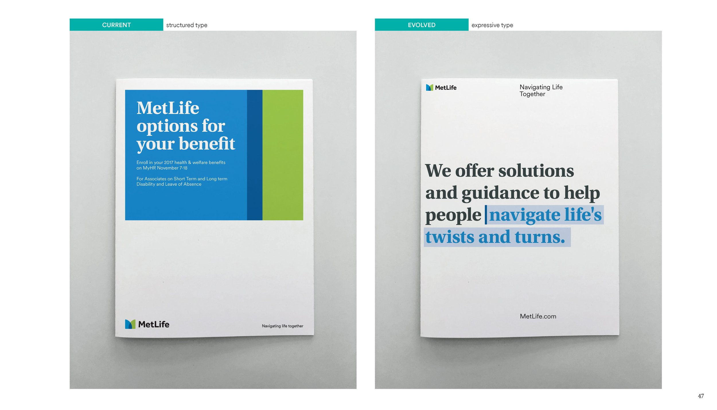
Expressive type was a strategy implemented to regain some humanness back into the campaign. “Navigating Life Together” was warmer in tone, empathetic in nature and positioned MetLife as a safe place to help consumers navigate their insurance.
At the time, the client was a bit burned out of their “filmstrip” aesthetic on the left, and wanted to focus more on the power
of words.
Rather than the filmstrip approach on the left, we leaned toward more singular, real life moments for the consumer to focus on. This emphasized the true heart of the campaign, “Flexible solutions for real life”.
Another move away from the filmstrip approach and instead focusing on the realities MetLife customers face. The copy suggests that while life throws unforeseen curveballs, MetLife can help customers prepare for the unexpected.
This was an instance of implementing a postcard-like aesthetic to the singular moment narrative by changing to black and white photography and adding a touch of illustration for a softer, more human effect.


